library(tidyverse)
library(rinat)
library(lubridate)
library(leaflet)MLK Shoreline and iNaturalist Observations
For the last few years I commuted to work most days by bicycle along the Martin Luther King Jr. Regional Shoreline Park in Oakland, CA. This will be a series of data science posts exploring personal data collected by my smart watch and publicly available weather, nature and biodiversity data collected in this park. It is my hope that this will show into the brain of how a data scientist thinks, learns, asks questions, creates models, and visualizes data from right in their back yard through a series of posts. This is an intro post pulling in the data and doing some basic data exploration and visualizations.
We can start by loading a few libraries to make data manipulation and visualization easier.
Set a bounding box around the park and subset some of the observations from the database that are “research” grade. Fortunately, this area is located in the San Francisco Bay Area with many professional and advanced amateur biologists around making observations. This park is also a popular spot for bird watching.
bounds <- c(37.72794, -122.23864,37.767032, -122.196754)
mlk_bio <- get_inat_obs(bounds = bounds, maxresults = 1000, quality = "research")
Inspect the data structure. At time of writing there are 5395 observations and 36 columns of data. We can see that there are various pieces of data that we would want to start taking a deeper look including: Scientific Name, the datatime of the observation, the latitude and longitude coordinates of the observation, associated image (image_url), and whether the observation is licensed as a CC for creative commons, to name a few. We also have a column of “user_login” data so we can see how many observations are contributed by different users.
dim(mlk_bio)[1] 1000 37names(mlk_bio) [1] "scientific_name" "datetime"
[3] "description" "place_guess"
[5] "latitude" "longitude"
[7] "tag_list" "common_name"
[9] "url" "image_url"
[11] "user_login" "id"
[13] "species_guess" "iconic_taxon_name"
[15] "taxon_id" "num_identification_agreements"
[17] "num_identification_disagreements" "observed_on_string"
[19] "observed_on" "time_observed_at"
[21] "time_zone" "positional_accuracy"
[23] "public_positional_accuracy" "geoprivacy"
[25] "taxon_geoprivacy" "coordinates_obscured"
[27] "positioning_method" "positioning_device"
[29] "user_id" "user_name"
[31] "created_at" "updated_at"
[33] "quality_grade" "license"
[35] "sound_url" "oauth_application_id"
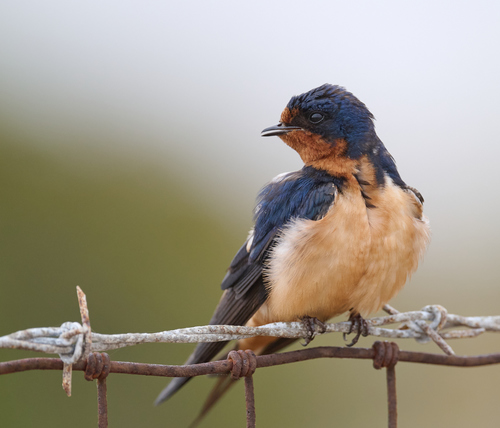
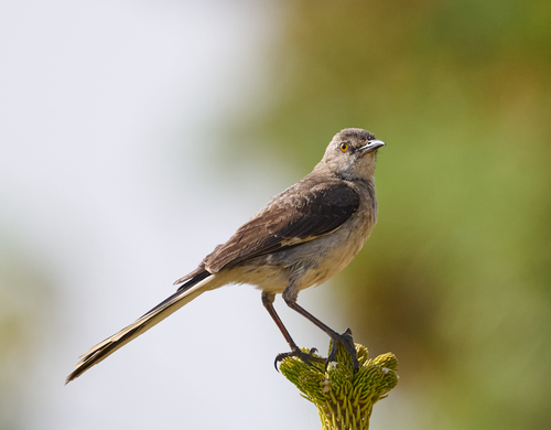
[37] "captive_cultivated" There are photos included with a majority of the observations. Let’s take a look.
Make a quick plot of the data without a map overlay just to see what it looks like colored by large taxonomic groupings.
mlk_bio_P1  <- ggplot(mlk_bio, aes(x=longitude, y = latitude, color = iconic_taxon_name)) +
       geom_point() + labs(color = "Taxon", title = "MLK Shoreline iNaturalist Observations")
mlk_bio_P1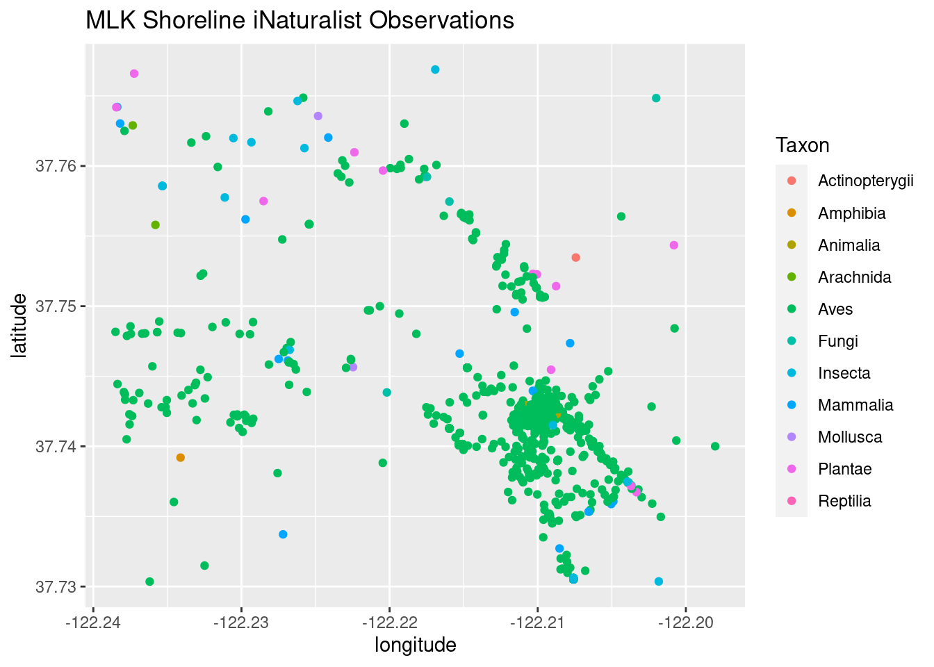
This is a popular birding spot, so one might expect there to be an over representation of bird (Aves) observations. Just how overrepresented are the Aves? A quick plot to take a look. Wow!
mlk_bio_P2  <- ggplot(mlk_bio, aes(x = iconic_taxon_name)) + stat_count() +
                    scale_x_discrete(guide = guide_axis(angle = 45))
mlk_bio_P2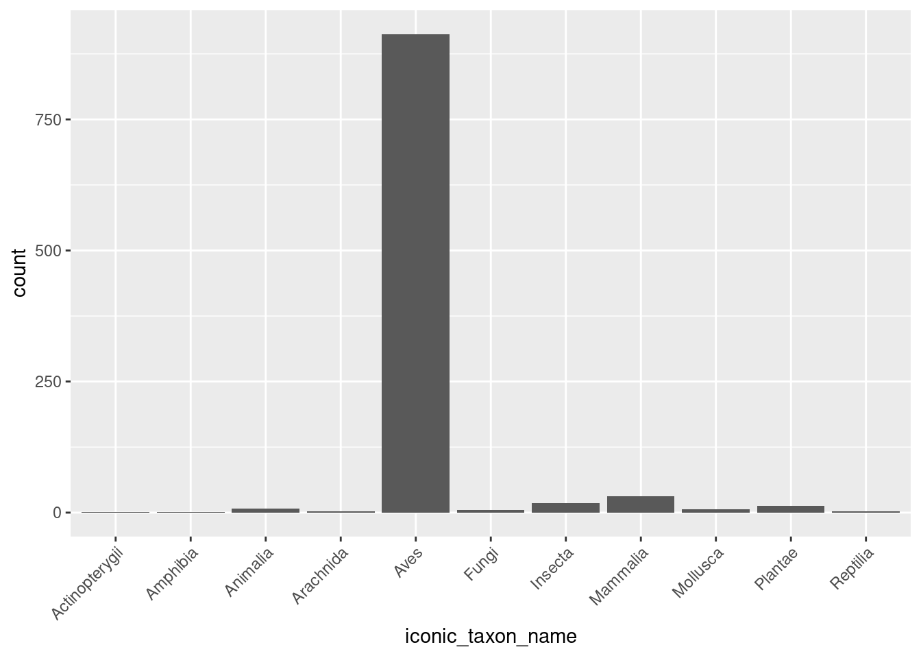
Take a look at the data with the Open Maps overlay to see the outline of the water front and the various roads and bridges where observers might be located.
mlk_bio %>% leaflet() %>% addTiles() %>%
addMarkers(~longitude, ~latitude)
Definitely over plotted, but will deal with that in another post. Until then!