# Install Fit File Reader if not already installed
if(!requireNamespace("remotes")) {
   install.packages("remotes")
}
remotes::install_github("grimbough/FITfileR")Introduction
I have discussed the importance of targeted heart-rate zone training numerous times before. This post will show three different trail running workouts on the same 13.15 km (8.17 mile) course with ~300m (984 ft) of elevation gain and loss. The route is an out and back lollipop loop with a majority of the climbing in the first half of the run. The route is a regular workout distance for me and I currently have 54 attempts accumulated over a few years. This provides ample data to look at trends over time and to compare different types of workouts over the same distance.
From my trained perspective, the heart rate zones break down as follows:
- 120-155 - Zone 1 - Nose breathing pace, all-day pace
- 156-162 - Zone 2 - Avoid if possible, too hard for Zone 1, too easy for Zone 3
- 163-173 - Zone 3 - 1.5-hour pace for me, or many shorter bursts
- 174-184 - Zone 4 - Shorter HARD efforts
- 185-195 - Zone 5 - Pushing max pace/effort
With that background out of the way let’s load the libraries.
library(FITfileR)
library(tidyverse)
Pull in a Zone 1 workout, arrange it by time-stamp and plot the latitude and longitude (removing exact coordinates).
RunZone1 <- readFitFile("~/DATA/data/local-route-zone1.fit") # load file
RunZone1 <- records(RunZone1) %>% bind_rows() %>% arrange(timestamp)


LocalRunplot1 <- ggplot(RunZone1, aes(x = position_long, y = position_lat)) +
                      coord_quickmap() +
                      geom_point() +
                      theme(axis.text.x=element_blank(),
                      axis.ticks.x=element_blank(),
                      axis.text.y=element_blank(),
                      axis.ticks.y=element_blank()
                      )
LocalRunplot1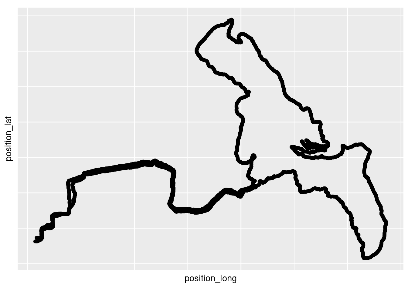
The heart rate zones do not record on the watch, only the heart rate values at each second interval. Here we make a new variable that is defined by the heart rate zones mentioned in the introduction. I add a manual color vector for the plotting so that all the plots are consistent with one another and with previous posts. And finally, just to keep things tidy, I also add a seconds column of data.
RunZone1$HRzone <- cut(RunZone1$heart_rate,c(0,120,158,164,173,184, 200))
levels(RunZone1$HRzone) <- c("R","Z1","Z2","Z3","Z4","Z5")
cols3 <- c("R" = "#d4d4d4",  "Z1" = "#5192cb", "Z2" = "#4cbd57",
          "Z3" = "#e4e540", "Z4"= "#ffb217", "Z5" = "#ff5733", "NA" = "#454545")
RunZone1$seconds <- as.numeric(rownames(RunZone1))
Now we can plot the entire workout and color it by the heart rate zones. This workout is primarily a Zone 1 workout, so you can see that most of the time is spent in Zone 1 (blue).
z1_p <- ggplot(RunZone1, aes(x=seconds,  y=heart_rate, col=HRzone)) +
      geom_point() +
      scale_x_continuous(name="Time (Seconds)") +
      scale_y_continuous(name="Heart Rate (Beats Per Minute)") +
      scale_color_manual(values = cols3)
z1_p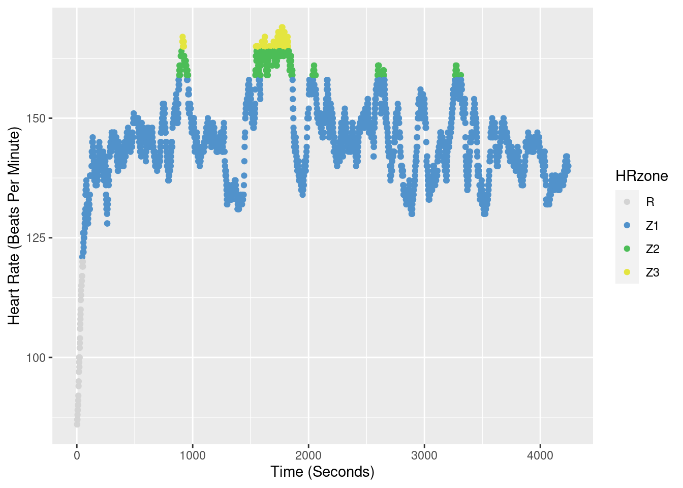
Here I do the same process as above for a Zone 1/Zone 2 workout. The plot shows a shift to the higher end of Zone 1 with more Zone 2.
RunZone2 <- readFitFile("~/DATA/data/local-route-zone1-2.fit") # load file
RunZone2 <- records(RunZone2) %>% bind_rows() %>% arrange(timestamp)

RunZone2$HRzone <- cut(RunZone2$heart_rate,c(0,120,158,164,173,184, 200))
levels(RunZone2$HRzone) <- c("R","Z1","Z2","Z3","Z4","Z5")
RunZone2$seconds <- as.numeric(rownames(RunZone2))

z2_p <- ggplot(RunZone2, aes(x=seconds,  y=heart_rate, col=HRzone)) +
      geom_point() +
      scale_x_continuous(name="Time (Seconds)") +
      scale_y_continuous(name="Heart Rate (Beats Per Minute)") +
      scale_color_manual(values = cols3)
z2_p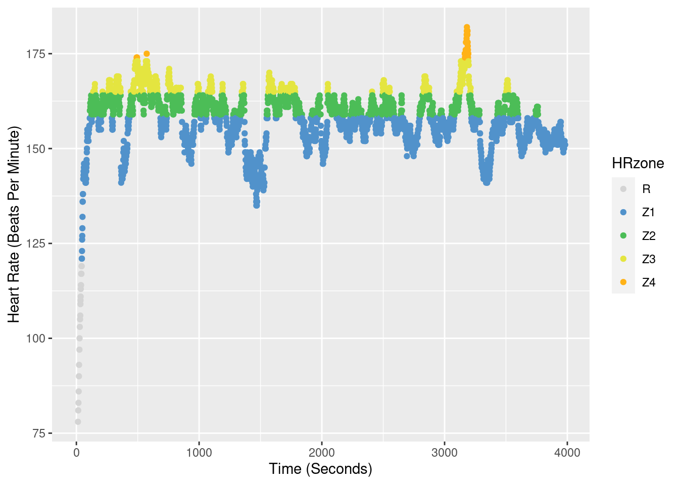
The run below is a Zone3/Zone4 heart rate zone run. This is my fastest time to date on this route at 1:00:31. I am shooting for a sub 1 hour next time I do a hard effort like this! The heart rate zones are shifted all the way up into Zone 3 (yellow) and Zone 4 (orange) with a few times I tipped into Zone 5.
RunZone3 <- readFitFile("~/DATA/data/local-route-zone3-FKT.fit") # load file
RunZone3 <- records(RunZone3) %>% bind_rows() %>% arrange(timestamp)

RunZone3$HRzone <- cut(RunZone3$heart_rate,c(0,120,158,164,173,184, 200))
levels(RunZone3$HRzone) <- c("R","Z1","Z2","Z3","Z4","Z5")
RunZone3$seconds <- as.numeric(rownames(RunZone3))

z3_p <- ggplot(RunZone3, aes(x=seconds,  y=heart_rate, col=HRzone)) +
      geom_point() +
      scale_x_continuous(name="Time (Seconds)") +
      scale_y_continuous(name="Heart Rate (Beats Per Minute)") +
      scale_color_manual(values = cols3)
z3_p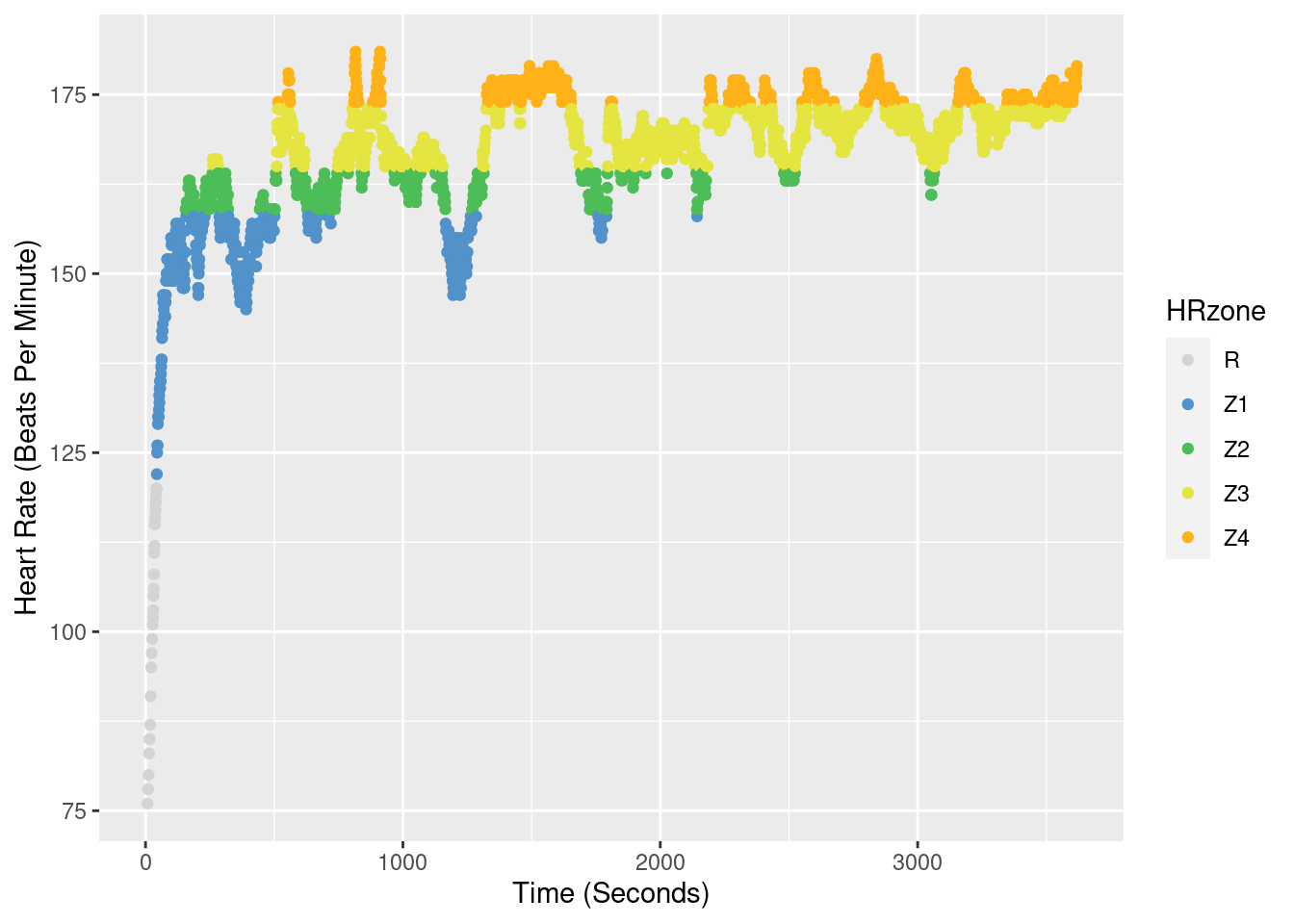
We will do some detailed comparisons in another post, but here we can make plots of the heart rate data as the number of seconds in each heart rate zone.
z1_p2 <- ggplot(RunZone1, aes(x=HRzone, fill=HRzone)) +
      geom_bar() +
      scale_y_continuous(name="Total Seconds in Heart Rate Zone") +
      scale_fill_manual(values = cols3)


z2_p2 <- ggplot(RunZone2, aes(x=HRzone, fill=HRzone)) +
      geom_bar() +
      scale_y_continuous(name="Total Seconds in Heart Rate Zone") +
      scale_fill_manual(values = cols3)


z3_p2 <- ggplot(RunZone3, aes(x=HRzone, fill=HRzone)) +
      geom_bar() +
      scale_y_continuous(name="Total Seconds in Heart Rate Zone") +
      scale_fill_manual(values = cols3)
These really show the shift from Zone 1 –> Zone 1/2 –> Zone 3/4. Plot them all and scroll down to compare.
z1_p2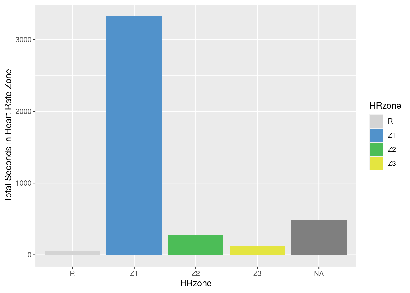
z2_p2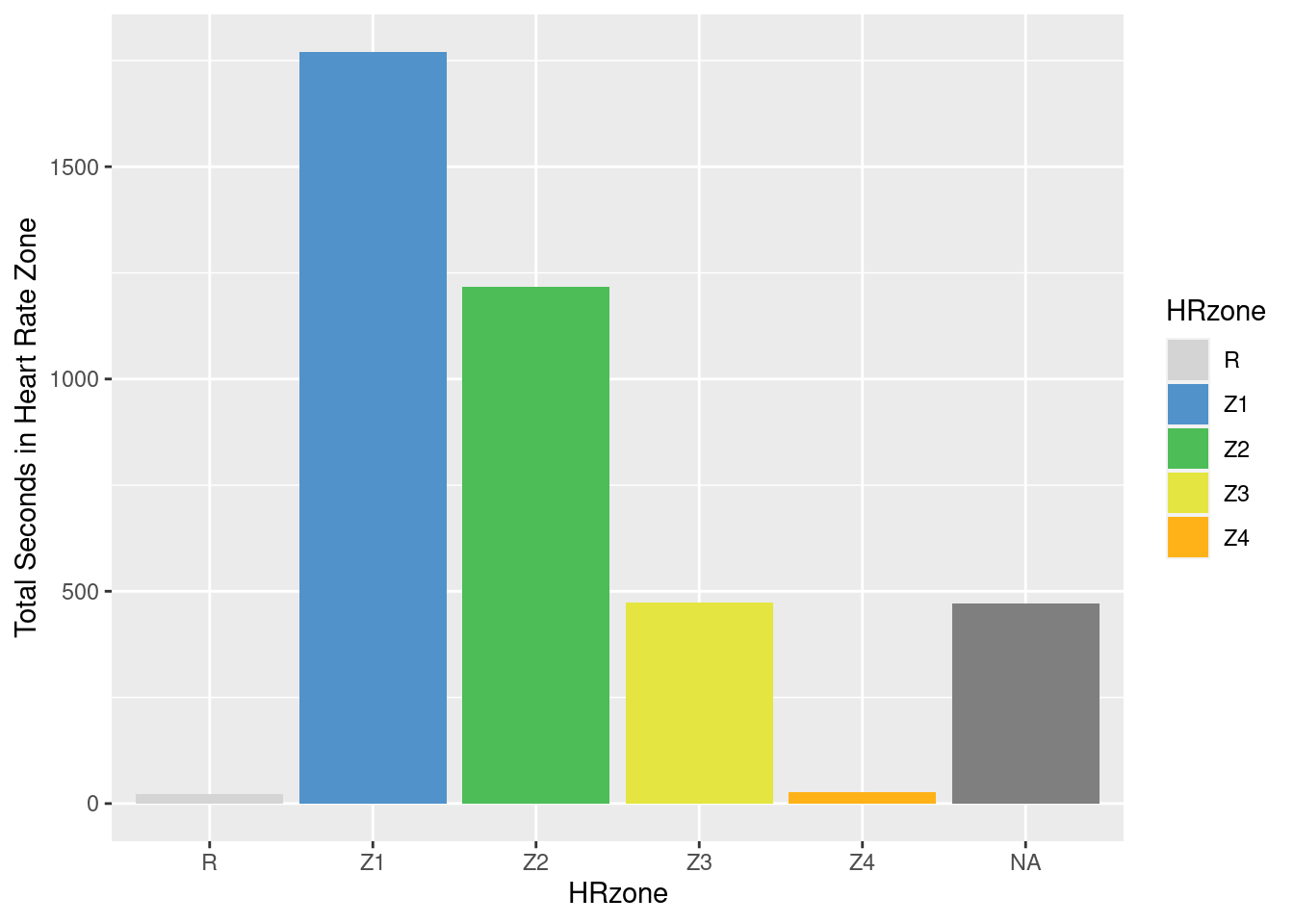
z3_p2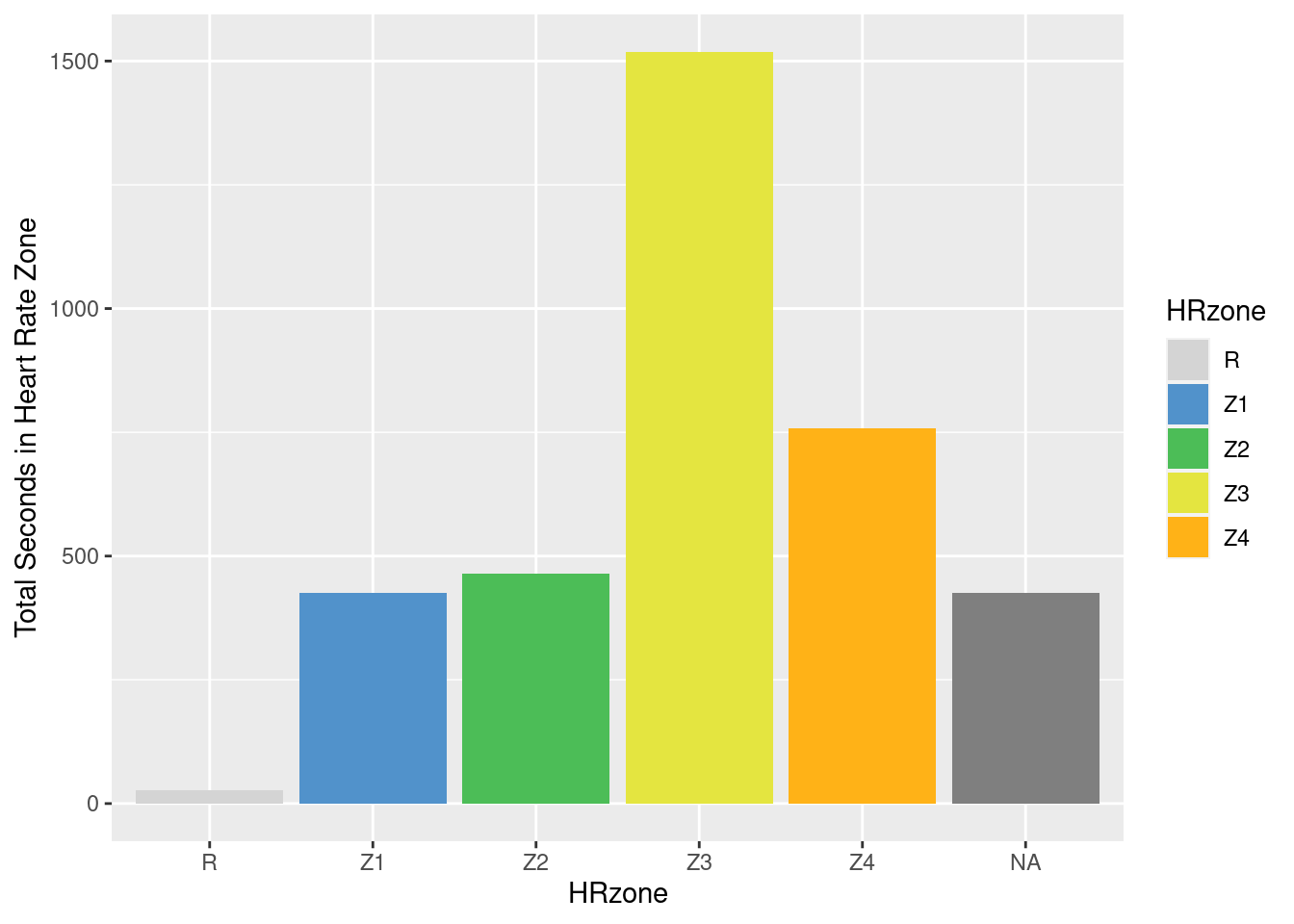
We will revisit these data to do more comparisons over the different parts of the workout course. If you are interested in other posts in this explorer series check out Explorer Fitness 1, Explorer Fitness 2, and Trail Running Training.