library(tidyverse)
library(lubridate)
library(zoo)This post is the third in a series teaching data journalists how to scrape website data, clean it up, and do some exploratory visualizations with it. See the other posts in the series Post 1, Post 2, and Post 4.
Introduction
I started collaborating with the Mount Shasta Avalanche Center for a long form data journalism project looking at snow and avalanche condition forecasting with the backdrop of climate change. This adds an additional layer of uncertainty into any type of short-term forecast. Forecasters put out daily forecasts that integrate a lot of weather, snowfall, wind speed, direction, terrain, and previous snowfall information along with on the ground observational data collected from snow pits. Here is a brief summary of how to read a forecast.
I thought this would be a good opportunity to show how you can collect, clean, and visualize your own data-sets for data journalism projects. I will be scraping the Avalanche Center’s public website to assemble an aggregated data-set of my own to ask my own questions. This is a series of posts on the topic using open-source data tools.
This post takes the scraped data from previous post and starts to make visual summaries of the data.
INFILE DATA HERE
load(file = "~/DATA/data/Avalanche-Data-2017-2023.RData")
ls()
[1] "weather3"The
unique(weather3$`Fx Rating `)[1] "LOW" "MOD" "CON" "HIGH" "NONE" "EXT" weather3$danger <- as.factor(weather3$`Fx Rating `)
# Define the desired order for factor levels
desired_order <- c("LOW", "MOD", "CON", "HIGH", "EXT")
# Reorder the factor variable according to the desired order
weather3$danger <- factor(weather3$danger, levels = desired_order)
# Quick few plots to make sure everything looks reasonable
weather_plot <- ggplot(weather3, aes(x=date, y=`Fx Snow (in) Min`)) +
geom_point()
weather_plot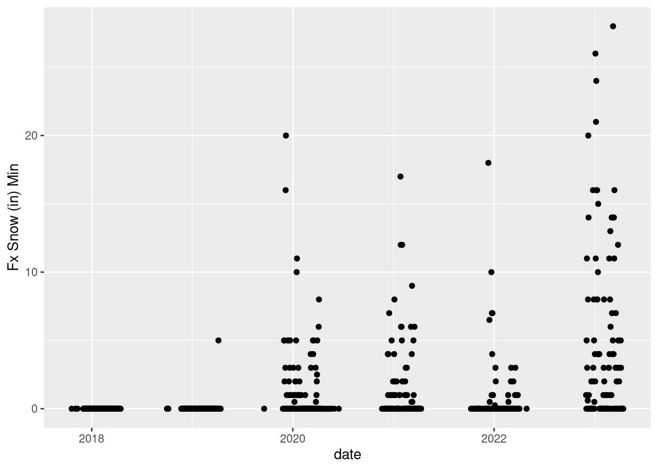
ggsave("~/DATA/images/weather-scraping-plot.png")

custom_colors <- c("LOW" = "green", "MOD" = "yellow", "CON" = "orange", "HIGH" = "red", "EXT" = "black")

weather_plot2 <- ggplot(weather3, aes(x=date, y=`Fx Wind (mi/hr) Max`, color = danger)) +
  geom_point(shape = 5, size = 4) + scale_color_manual(values = custom_colors)
weather_plot2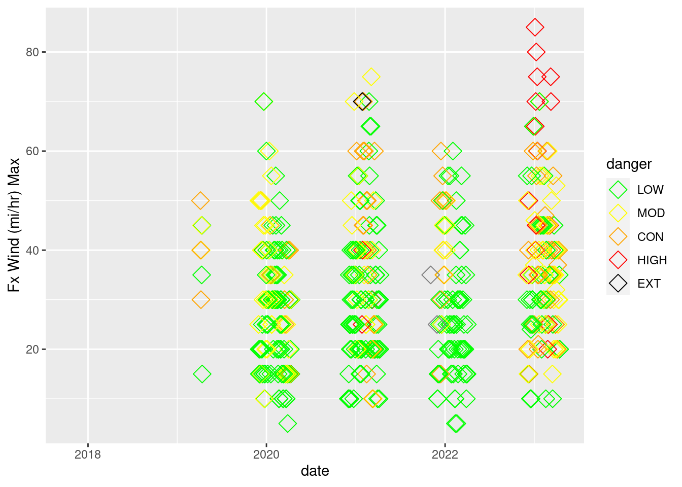
ggsave("~/DATA/images/weather-scraping-plot-danger.png")Now we are going to use the zoo package to calculate rolling averages of snow fall and wind - two important interacting components for creating avalanche conditions. Experiment a bit with the window width if you like. I think that a three day average for the amount of snow fall over the past 24 hours is a good metric.
# # make sure library zoo is loaded
weather3$snow_avg_3 <- rollapply(weather3$`Ob Snow (in) HN24`, width = 3,
                                 FUN = mean, align = "left", fill = NA)
weather3$snow_avg_5 <- rollapply(weather3$`Ob Snow (in) HN24`, width = 5,
                                 FUN = mean, align = "left", fill = NA)
weather3$wind_avg_5 <- rollapply(weather3$`Ob Wind (mi/hr) Avg`, width = 5,
                                 FUN = mean, align = "left", fill = NA)
weather3$wind_avg_3 <- rollapply(weather3$`Ob Wind (mi/hr) Avg`, width = 3,
                                 FUN = mean, align = "left", fill = NA)


weather_plot3 <- ggplot() +
                 geom_point(data = weather3,
                            aes(x = date, y=snow_avg_3,
                                color = danger), shape = 18, size = 4) +
                 scale_color_manual(values = custom_colors) +
                 scale_y_continuous(name = "Snow Avg 3 days",) +
                 labs(title = "",
                      color = "Avalanche Danger")
weather_plot3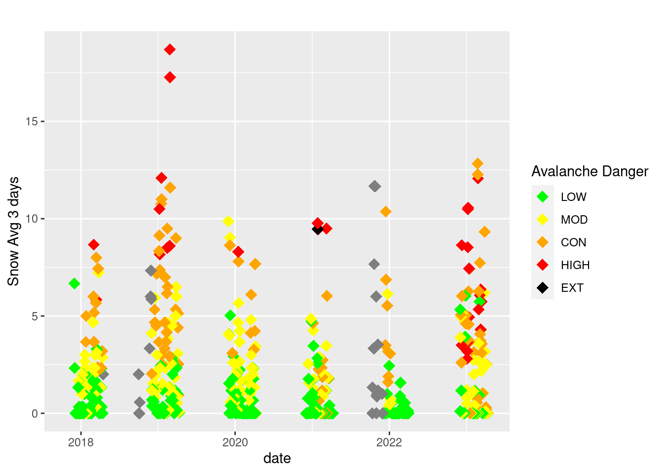
ggsave("~/DATA/images/MSAC_3daySnow_AvyWarning.png", height = 10, width = 8)

weather_plot4 <- ggplot() +
                 geom_point(data = weather3,
                            aes(x = date, y=wind_avg_3),
                            color = "azure4") +
                 geom_point(data = weather3,
                            aes(x = date, y=snow_avg_3,
                            color = danger), shape = 18, size = 4) +
                 scale_color_manual(values = custom_colors) +
                 scale_y_continuous(name = "3 day Wind (mi/hr) Avg",
                           sec.axis = sec_axis(~.,
                           name = "Rolling Average Snow 3 day Accumulation")) +
                 labs(title = "",
                      color = "Avalanche Danger")
weather_plot4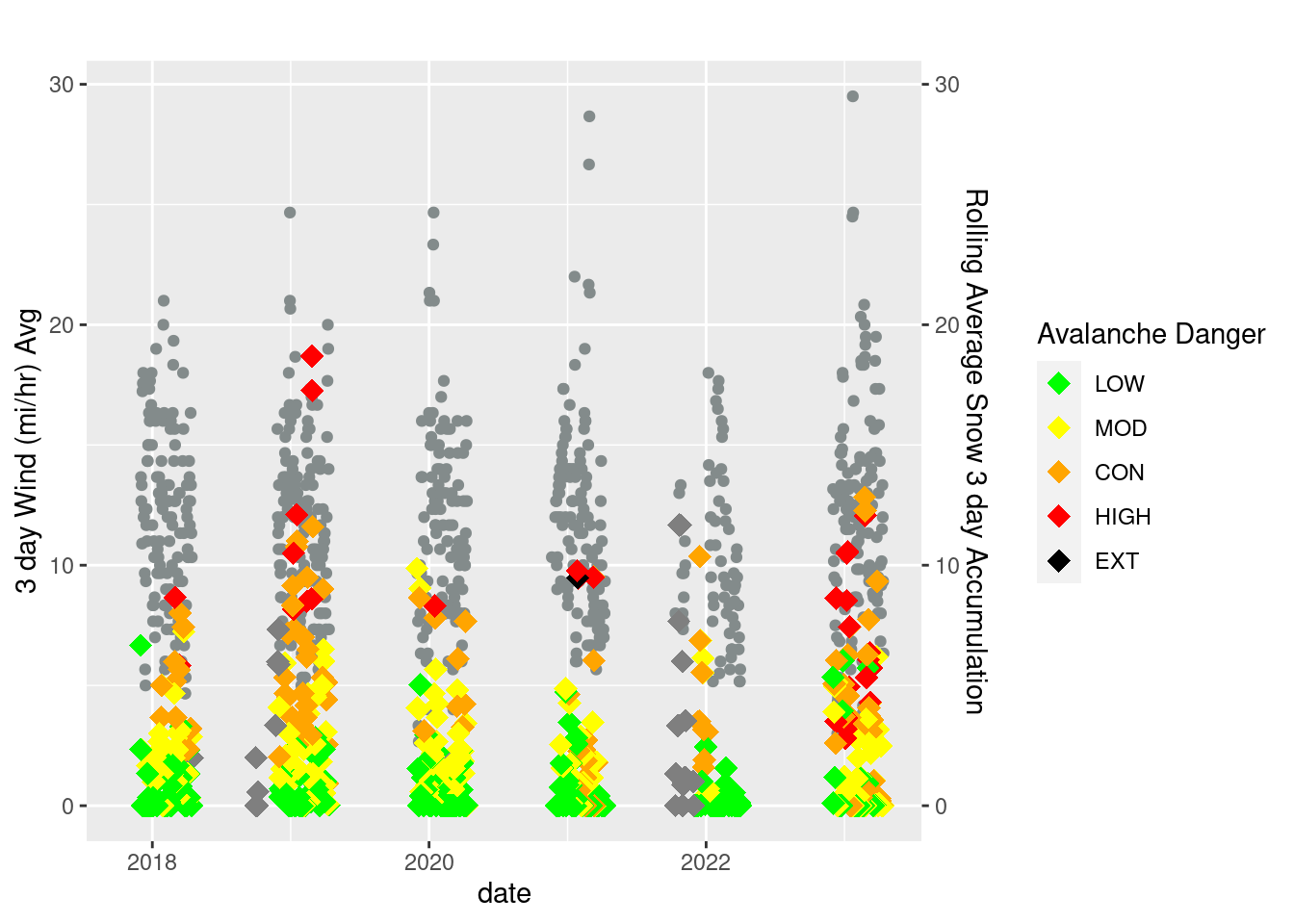
ggsave("~/DATA/images/MSAC_3daySnowWind_AvyWarning.png", height = 10, width = 8)In California the snow season starts when the rain historically starts to fall consistently in October and goes through the end of April of the following year. Let’s partition up this entire data set to reflect the winter seasons.
weather3 <- weather3 %>%
  mutate(season = case_when(
    between(date, as.Date("2017-10-01"), as.Date("2018-04-30")) ~ "Season17-18",
    between(date, as.Date("2018-10-01"), as.Date("2019-04-30")) ~ "Season18-19",
    between(date, as.Date("2019-10-01"), as.Date("2020-04-30")) ~ "Season19-20",
    between(date, as.Date("2020-10-01"), as.Date("2021-04-30")) ~ "Season20-21",
    between(date, as.Date("2021-10-01"), as.Date("2022-04-30")) ~ "Season21-22",
    between(date, as.Date("2022-10-01"), as.Date("2023-04-30")) ~ "Season22-23"
  ))

# Make the seasons span the years
weather3 <- weather3 %>%
  mutate(
    water_year = ifelse(month(date) %in% 1:9, year(date), year(date) + 1),
    day_of_water_year = as.integer(difftime(date, as.Date(paste0(year(date), "-10-01")), units = "days")) + 1
  )

weather3$day_of_water_year[weather3$day_of_water_year <= 0] <- weather3$day_of_water_year[weather3$day_of_water_year <= 0] + 365 + as.integer(leap_year(weather3$date[weather3$day_of_water_year <= 0]))


weather3$season <- as.factor(weather3$season)
filtered_data <- weather3 %>% filter(day_of_water_year < 205 & day_of_water_year > 50)
Plot the new filtered dataset.
weather_plot4 <- ggplot(filtered_data, aes(x = day_of_water_year, y = snow_avg_3, color = danger)) +
  geom_point(shape = 18, size = 5) +
  facet_wrap(~season, ncol = 1) +
  scale_color_manual(values = custom_colors) +
  scale_y_continuous(name = "Rolling Snow Average (3 day)") +
  labs(title = "", color = "Avalanche Danger")
weather_plot4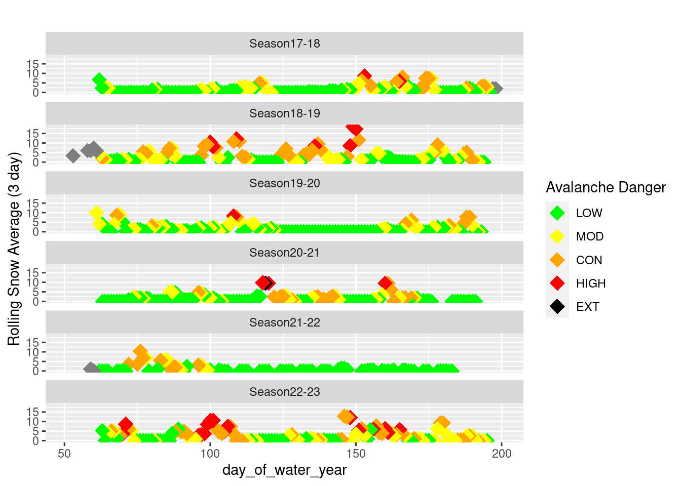
Save the data for the next post.
save(filtered_data, file = "~/DATA/data/Avalanche-Data-2017-2023-filtered.RData")See the other posts in the series Post 1, Post 2 and Post 4.