library(tidyverse)
library(lubridate)
library(gganimate)This post is the fourth in a series teaching data journalists how to scrape and visualize website data. See the other posts in the series Post 1, Post 2, Post 3 and Post 4.
Introduction
I started collaborating with the Mount Shasta Avalanche Center for a long form data journalism project looking at snow and avalanche condition forecasting with the backdrop of climate change. This adds an additional layer of uncertainty into any type of short-term forecast. Forecasters put out daily forecasts that integrate a lot of weather, snowfall, wind speed, direction, terrain, and previous snowfall information along with on the ground observational data collected from snow pits. Here is a brief summary of how to read a forecast.
I thought this would be a good opportunity to show how you can collect, clean, and visualize your own data-sets for data journalism projects. I will be scraping the Avalanche Center’s public website to assemble an aggregated data-set of my own to ask my own questions. This is a series of posts on the topic using open-source data tools.
This post builds on the previous posts to make an animated data visualization of avalanche forecast variation across multiple seasons of snowfall based on the snow fall over the previous three days.
Load the libraries.
Load the data, make the custom colors for plotting, and make a plot of the rolling three day average snow fall across all the seasons in the data set. Notice that this rolling average captures much of the variation in the moderate, high, and extreme snow conditions. Or to put it another way, you will likely have to have fresh snow to increase the avalanche danger across these seasons. This is a general statement because there is a lot more that goes into it of course! I hope to get more information from showing this to the avalanche forecasters.
load(file = "~/DATA/data/Avalanche-Data-2017-2023-filtered.RData")
ls()
[1] "filtered_data"custom_colors <- c("LOW" = "green", "MOD" = "yellow", "CON" = "orange", "HIGH" = "red", "EXT" = "black")
weather_plot5 <- ggplot(filtered_data, aes(x = day_of_water_year, y = snow_avg_3, color = danger)) +
geom_point(shape = 18, size = 5) +
facet_wrap(~season, ncol = 1) +
scale_color_manual(values = custom_colors) +
scale_y_continuous(name = "Rolling Snow Average (3 day)") +
labs(title = "", color = "Avalanche Danger")
weather_plot5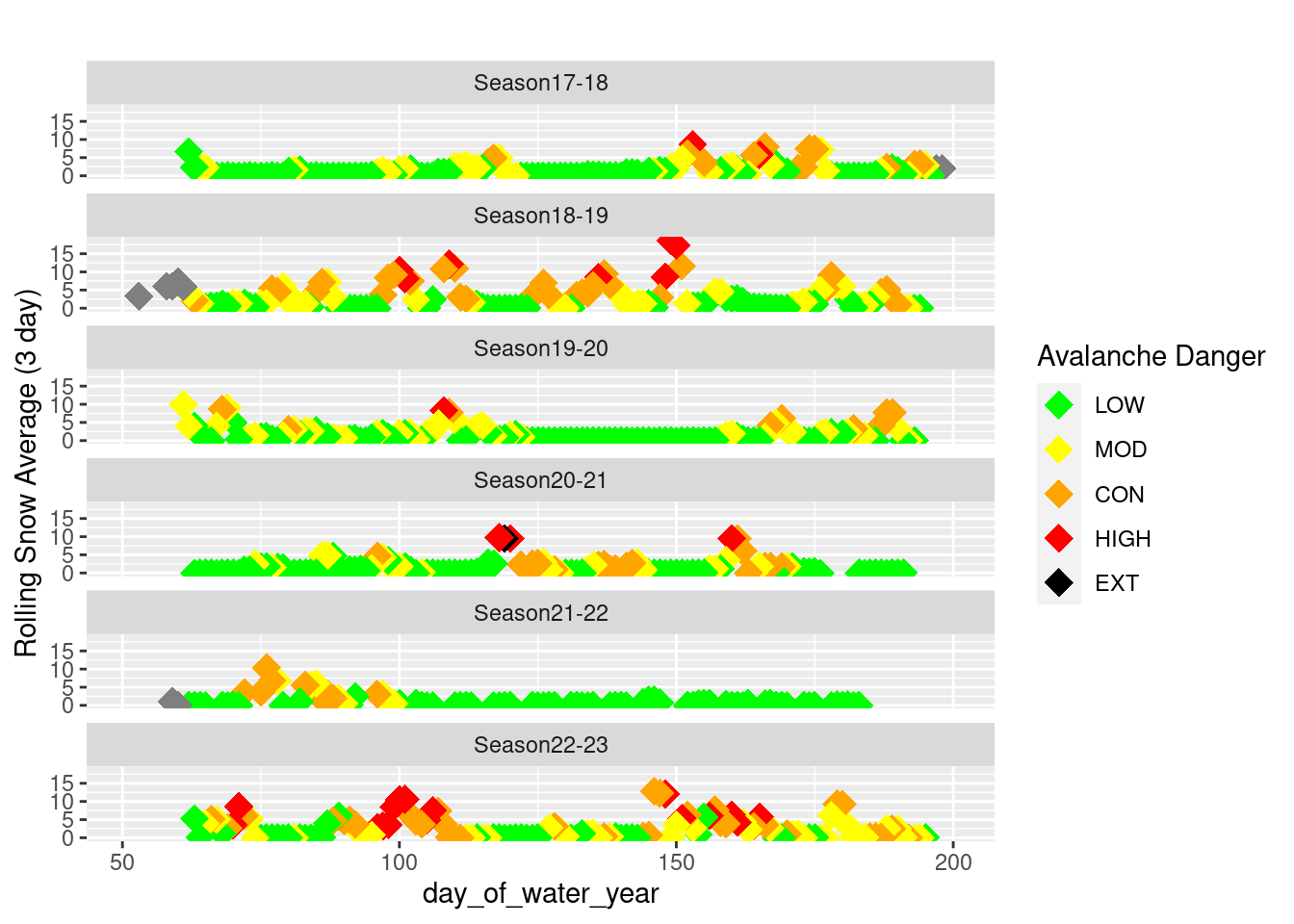
ggsave("~/DATA/images/MSAC_17_23_3daySnow_AvyWarning.png", height = 10, width = 8)Now we can use the gganimate package to take a look at how the snowfall impacts forecasted avalanche danger.
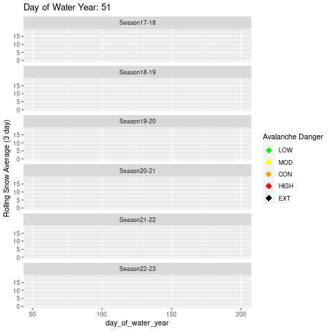
animated_plot <- ggplot(filtered_data, aes(x = day_of_water_year, y = snow_avg_3, color = danger)) +
  geom_point(shape = 18, size = 4, aes(group = day_of_water_year)) +
  scale_color_manual(values = custom_colors) +
  scale_y_continuous(name = "Rolling Snow Average (3 day)") +
  labs(title = "Day of Water Year: {frame_along}", color = "Avalanche Danger") +
  facet_wrap(~ season, ncol = 1) +
  transition_reveal(day_of_water_year) +
  shadow_mark()

# View the animation
animated_plot

# Save the animation
anim_save("~/DATA/images/animated_avalanche_plot.gif", animated_plot)